


No products found in this category.
Depth without a pattern
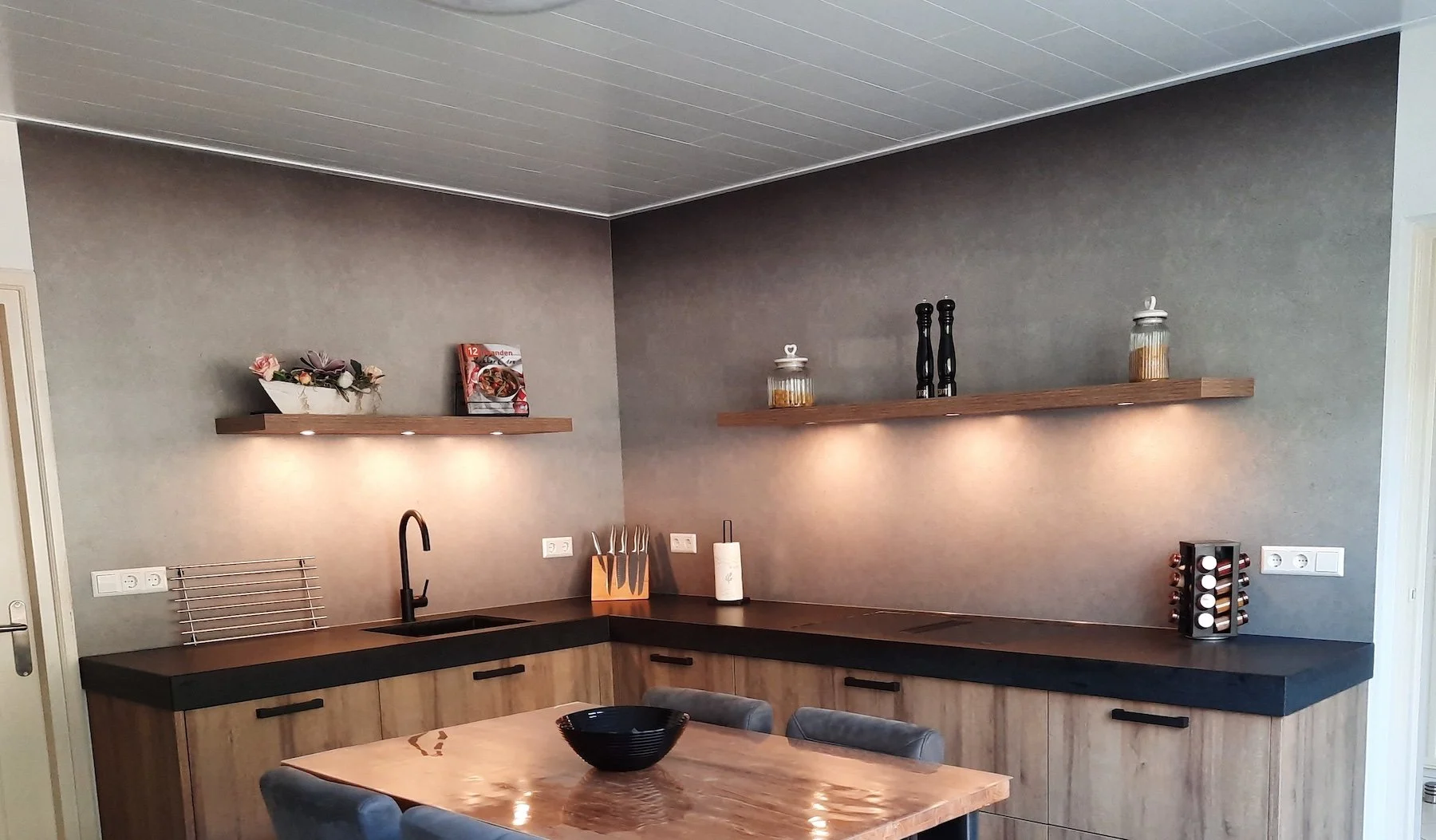
A flat colour behind the hob can fall dead, especially in a kitchen with matte fronts and nothing else to catch the light. A texture print fixes that. From across the room it reads as a solid; up close you see the linen weave, the plaster or the soft gradient. It gives the wall something to do without competing with the kitchen you have just chosen.
Grey, and the trap in it
Grey is the most requested texture we print and the easiest one to get wrong. Under a wall unit, with no daylight on it, a panel will read several shades colder than the sample you held up at the window. Order a 20 x 20 cm sample and tape it exactly where the panel goes, then look at it in the evening as well as at noon.
Matte or gloss
A matte coating keeps a fine structure believable and hides fingerprints. Gloss throws light back and makes a narrow galley feel wider, though it does flatten the subtlest reliefs. Both are wipe clean, seamless and cut to size. Want the texture to carry a clear motif, hexagons or a concrete slab, look at the concrete, tile and stone designs.