Terracotta, sage, sand, taupe and mauve: warm colours are the shades that make a wall feel cosy straight away. They do that without making the room dark, and they go with wood, linen and plants, the materials most homes already have. Below we go through them colour by colour: which designs we have, how to combine warm colour wallpaper with what is already in the room, and how to stop the colour on the wall looking different from the one on your screen.
What warm colours do to a room
A warm colour seems to come closer. A terracotta wall seems to move towards you, while a light grey one recedes. That is why warm-toned wallpaper works so well in a large, open-plan living room or a bedroom with a high ceiling: the space feels smaller and more intimate. It can work in a small room too, but then go for the lighter end of the colour, sand rather than rust.
Worth knowing: warm is not the same as bright. Most of the designs below are muted shades, with grey, brown or beige mixed in. That makes them calmer than they look on a colour chart, and it makes them easy to combine.
Colour by colour: the designs
Terracotta and orange
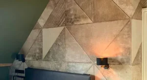
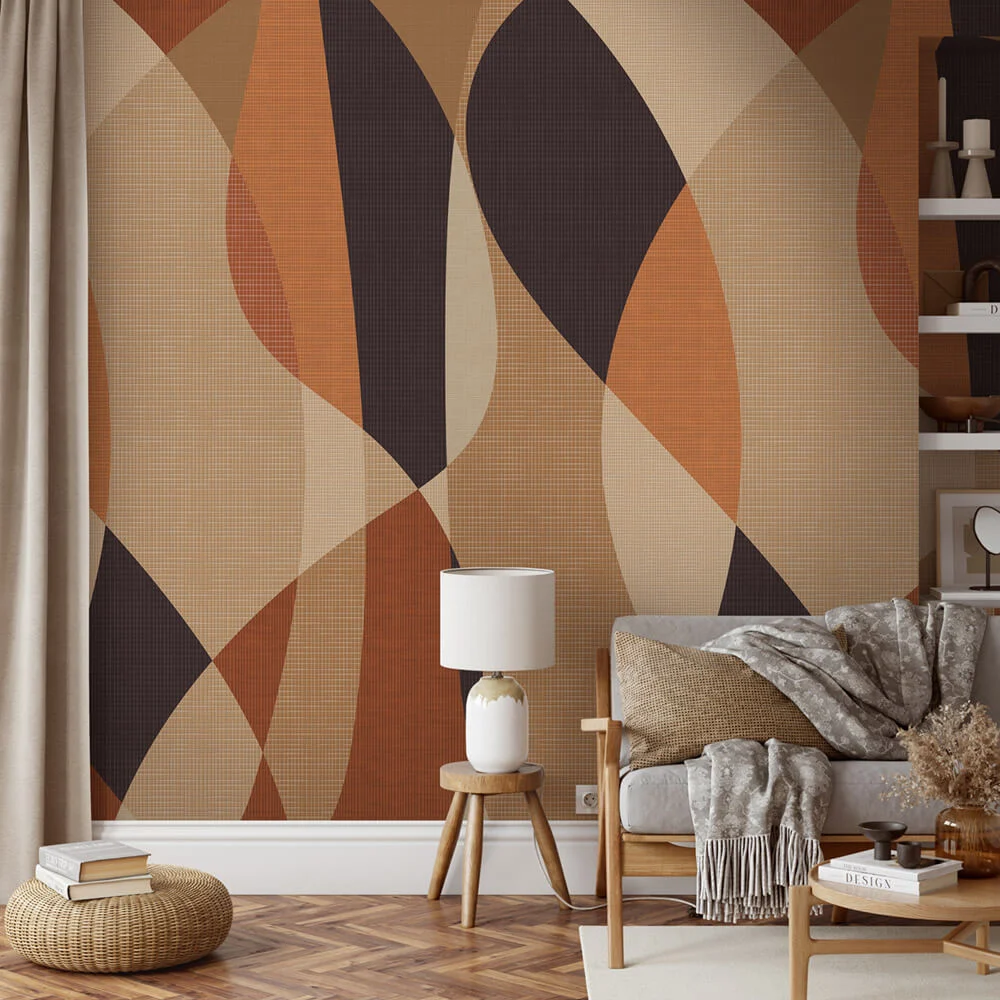
The boldest warm colour, and the one with the most character. Happening Warm has tall, curved leaf shapes in orange, terracotta, sand and aubergine. Home Terra is more graphic: quarter tiles and arches in terracotta and sand with a stone texture, calm enough for behind a bed. And Boho Love Copper combines large circles in terracotta and brown with black, which gives the design more weight.
Green and sage
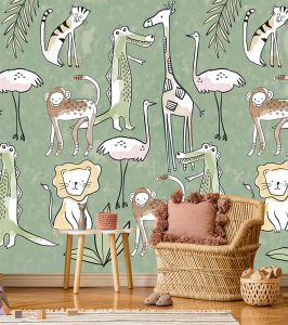
Muted green is the warm alternative to white: calm, but not bare. Be Square Green is made up of large tiles in sage and sea green, each with its own texture of marble, concrete or plaster, plus a few graphic arches and triangles. Relax Moss is softer: pale green, elongated leaf shapes with a thin golden-brown line. Green looks good next to light wood, rattan and lots of plants, and it suits a bedroom too.
Beige, sand and taupe
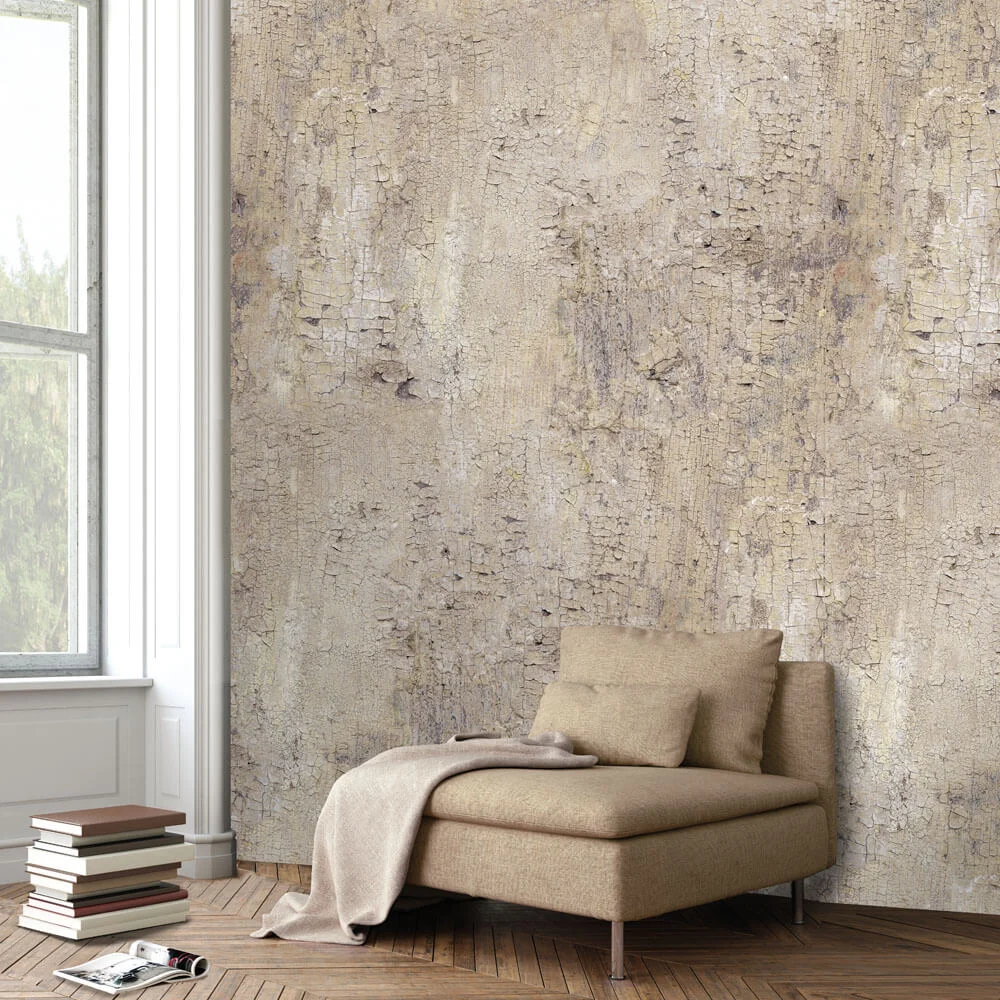
The calmest group, and the easiest place to start. Trondheim Taupe looks like old plasterwork with fine cracks, in taupe and sand. This World Taupe is a pattern of blocks in sand, taupe and greyish brown, Go With The Flow Natural has wavy slats in sand and cream that give the impression of relief, and Flowing Leaves Beige large tone-on-tone leaves on a linen texture. These designs give a wall depth without the colour taking over the room.
Mauve and aubergine
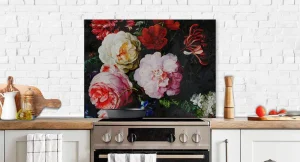
If you want warm but not earthy, look to mauve, dusty pink and aubergine. Mauve Afternoon shows large flowers in mauve, pink and cream on a dark aubergine background. It is a design for a dining area or a bedroom where you want to linger in the evening, less so for a small, dark room. You will find more in this direction under floral wallpaper.
Copper, amber and wood
Wood is a warm colour in its own right, and on the wall it works the same way. Schönbrunn Warm is a herringbone pattern of wooden planks in warm browns, while Be Square Warm sets tiles in copper, amber and rust side by side. Both are darker than the rest of this list, so choose a wall that gets plenty of light.
Pairing with floors, wood and furniture
A warm wall only settles into a room when it finds something to echo. Three things to bear in mind:
- The floor. Oak and other warm wooden floors go with almost every shade above. With a cool grey floor, sand or taupe is a better choice than terracotta, otherwise the two will clash.
- Repeat one colour. Pick up a shade from the wallpaper in a cushion, a throw or a vase. Then the wall belongs to the room instead of working against it.
- The other walls. Keep them off-white or in the lightest shade of the design. Brilliant white next to terracotta looks harsh; a warm white with a hint of yellow or beige does not.
Quiet or bold
Within each colour you can choose between a design that is almost a texture and one that makes a statement. From a distance, Trondheim Taupe and Flowing Leaves Beige read almost as a plain wall with depth. Happening Warm and Boho Love Copper you will notice from the other side of the room. For a bedroom or a small space the quiet end usually works better; for one wall in a large living room you can be bolder. Ideas wall by wall are in our article on living room wallpaper ideas.
Judging colour: always order a sample
With warm colours in particular, the gap between screen and wall is big. Terracotta can look brighter or redder on a phone than in real life, and beige turns grey on one screen and yellow on another. So order a sample first. A small sample of 12.5 × 18 cm costs €2.50 and, ordered before 4pm, arrives within 1 to 3 working days. With a large motif, a large sample of 50 × 100 cm, for €25, also gives you an idea of the scale. Put it up on the wall you want to paper and look at it in daylight and under lamplight: a warm colour changes more in the evening than a cool one.
By the roll or made to measure
Every design is printed on non-woven wallpaper, in drops 50 cm wide. For most, one roll covers a wall of 200 × 280 cm; the exact size is listed with each product. For made to measure you enter the width and height of your wall, adding 5 cm to each measurement, and pay €29 per m², with the width rounded up to whole drops. For a wall of 300 × 250 cm you enter 305 × 255 cm, which works out at 3.50 × 2.55 m and costs €258.83. The wallpaper configurator shows the price for your size straight away. The wallpaper is printed after you order; allow 2 to 8 working days for delivery in the Netherlands. How to hang it is explained in hanging non-woven wallpaper.
Frequently asked questions
Which wallpaper colour makes a room feel warmer?
Shades with red, yellow or brown in them: terracotta, ochre, sand, taupe and mauve. They bring a wall closer and make a large space cosier. A muted green such as sage is calmer, but it also looks warm next to wood.
Can I use warm wallpaper in a small room?
Yes, if you go for the lighter end of the colour. Sand, beige and light taupe add warmth without making the room smaller. Save terracotta and aubergine for a larger space or for one wall with plenty of daylight.
What wall colour goes with warm wallpaper?
An off-white with a hint of yellow or beige, or the lightest shade from the design itself. Brilliant white next to a warm colour looks harsh.
How do I know the colour will look right in real life?
Order a sample. A small sample costs €2.50, a large sample of 50 × 100 cm €25. Look at it on the wall itself, during the day and in the evening.
Getting started
Browse every design in our wallpaper, or search by style: bohemian and abstract for the bolder warm shades, Japandi for the calm ones. Order samples in two or three colours and hang them side by side: you will see straight away which is warm enough and which is too much.
Warm colours on your wall
We print every design to the size of your wall. Order a sample first, so you can see the colour in your own light.